Unveiling the Story Behind the Pixiqo Logo: A Masterpiece of Marketing and Branding Strategy
In the competitive world of branding, a logo is not just an emblem—it’s the visual representation of a company’s soul, values, and promises. At Pixiqo, we’ve created a logo that embodies elegance, modernity, and innovation. But what truly sets our logo apart is the strategy and vision behind it. Let’s explore how the Pixiqo logo has been designed with a purpose, its role in branding, and how it aligns with the strategies used by global giants.
The Vision Behind the Pixiqo Logo
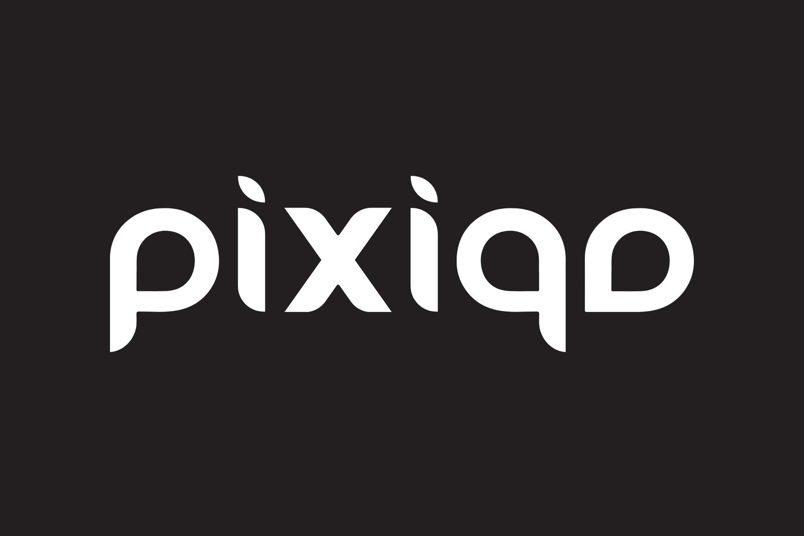
The Pixiqo logo is a minimalist design with a significant depth of meaning. The lowercase typography exudes friendliness and approachability, while the clean font reflects precision and professionalism. What makes it unique are the leaf-like shapes integrated into the design, symbolizing growth, sustainability, and creativity—three pillars that define our brand.
The color palette of the Pixiqo logo is another crucial aspect. We have used:
- #231f20 (Black): Represents sophistication, strength, and authority, giving the logo a bold and timeless appearance.
- #f5f5f5 (White): Adds clarity, simplicity, and balance, ensuring the design feels fresh and clean.
This monochromatic combination creates a sense of trust and elegance, aligning Pixiqo with high-end branding standards while staying visually striking across all mediums.
The Branding Psychology: How It Stands Out
-
Simplicity Meets Sophistication
Simplicity is the ultimate sophistication. The Pixiqo logo’s design is minimalistic yet impactful, ensuring it remains versatile and timeless—qualities seen in logos of renowned brands like Apple and Nike. -
Symbolism and Growth
The leaf-inspired accents signify growth and innovation, values that resonate not just with Pixiqo but also with forward-thinking brands like Amazon (the arrow symbolizing A to Z services) and Adidas (stripes for progress and movement). Pixiqo’s logo taps into similar strategic storytelling, making it both relatable and aspirational. -
Memorability Through Simplicity
Brands like Coca-Cola and Google have shown that simplicity, paired with a unique touch, creates memorability. Pixiqo’s clean design ensures it stays in the minds of our audience while maintaining its professional appeal.
Strategic Impact: Connecting Branding and Marketing
Logos are not standalone designs; they are marketing tools. Here’s how Pixiqo’s logo mirrors strategies used by global brands:
-
Versatility Across Platforms:
Similar to McDonald’s Golden Arches or Starbucks’ mermaid, the Pixiqo logo is adaptable for all branding needs—whether it’s a business card, website banner, or social media graphic. -
Establishing Trust:
Colors play a powerful role in building trust. Just like IBM’s blue signifies reliability or Chanel’s black and white conveys luxury, Pixiqo’s black and white combination delivers sophistication and clarity, appealing to both startups and established businesses. -
Building Emotional Connections:
Logos that evoke emotions leave a lasting impact. Much like how Mercedes-Benz uses its logo to represent excellence and reliability, Pixiqo’s logo creates a sense of innovation and trust—qualities that resonate with our clients.
The Inspiration: Learning from Global Brands
To understand the impact of the Pixiqo logo, let’s draw parallels with other global branding successes:
- Apple: The bite taken out of the Apple logo represents accessibility and usability—values that align with their brand identity. Similarly, Pixiqo’s leaves symbolize creativity and growth, reflecting our mission to nurture brands.
- Nike: The swoosh logo, symbolizing motion and victory, is a simple yet powerful design. Pixiqo follows a similar philosophy—minimalistic design that speaks volumes.
- Amazon: The arrow from A to Z in Amazon’s logo tells a story. Pixiqo’s logo, with its balanced and thoughtful design, tells our story of providing comprehensive, innovative branding solutions.
Color Psychology in Action
The #231f20 black in Pixiqo’s logo speaks of professionalism and authority, while the #f5f5f5 white ensures clarity and readability. This duality mirrors the branding strategy of iconic brands like Chanel, where the black-and-white contrast symbolizes luxury, simplicity, and modernity. Pixiqo employs the same principle to position itself as a premium service provider in the branding industry.
Why the Pixiqo Logo Is Your Branding Ally
The Pixiqo logo is not just a design—it’s a reflection of our commitment to excellence. It communicates who we are, what we stand for, and the value we bring to our clients. By combining strategic simplicity with meaningful symbolism, our logo serves as a beacon of trust, creativity, and professionalism.
Whether you’re a startup seeking to establish your identity or an established brand looking for a refresh, Pixiqo is here to bring your vision to life. Our logo is the beginning of a journey toward branding that captivates, communicates, and converts.
Let’s create something extraordinary together. Partner with Pixiqo, and let your brand shine!
Most Recent Posts
- All Posts
- Branding Tips
- Marketing Strategies
- Social Media Strategy
- Success Stories
Most Recent Posts
- All Posts
- Branding Tips
- Marketing Strategies
- Social Media Strategy
- Success Stories


